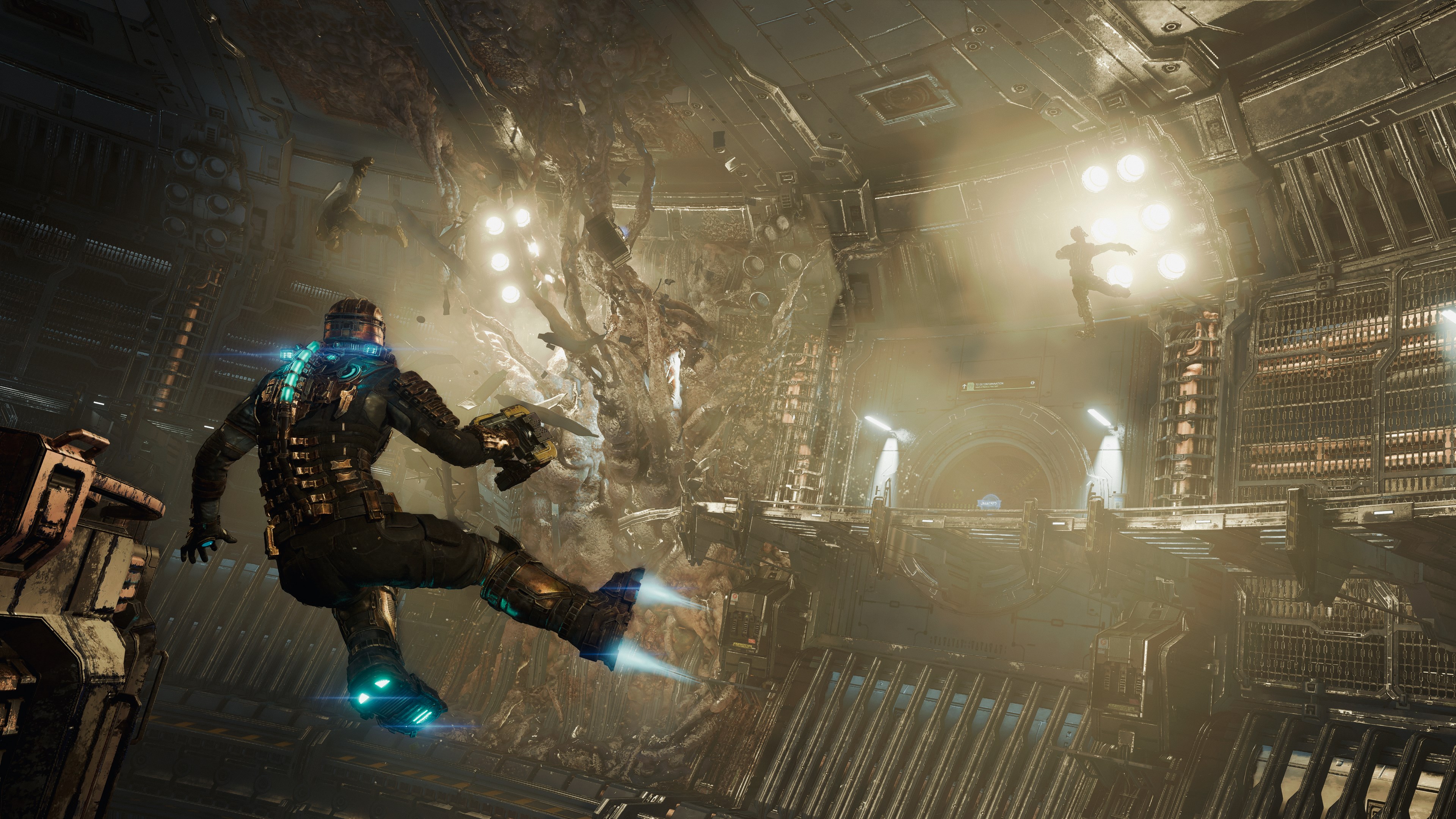
This is a technical analysis and breakdown of multiple options going up against one another. Here you can see the Dead Space Xbox Series X vs Xbox 360 comparison which will provide a direct visual showcase within the video. This is then filled out with the text based information detailed further down in this article.
This is to provide easier options for viewing, and context for when wanting to find out what exactly is going on between the various selections being shown upon the video. Mostly you get a visual display, and if you’d prefer to just read what’s present you can also see that in action which is a good mix of choices.
There’s not only a quick body of information text, but also a quick table area to provide fast details if you’re not wanting to dive deeply into the topic. With that, you can watch the video presentation right here, or head further back to find out more about what’s being displayed.
Xbox Series X |
|||
---|---|---|---|
Resolution (FSR 2.1.2) | Quality: 4k (3840x2160p) Performance: 1440p | ||
Frame Rate | Quality: 30fps Performance: 60fps | ||
HDR (High Dynamic Range) | Yes | Xbox 360 |
|
Resolution | 720p | ||
Frame Rate | 30fps | ||
HDR (High Dynamic Range) | Auto HDR |
Side by Side Comparison Technical Notes
This was a fun one to compare as we see massive gains within the Dead Space Remake in comparison to the original Xbox 360 version of the game that launched ever so many years ago. You’re seeing multiple graphic options with modern upscaling techniques through FSR which is AMD’s SuperFidelity option.
The first is pushing towards a full 4k resolution at 30fps with Ray Traced Ambient Occlusion and then there’s the default Performance mode pushing towards 1440p at 60fps. The original version just featured a fairly now jagged 720p at 30fps. Both now have HDR though the new verison is a native solution and the original was Auto HDR through backwards compatibility.
The games also look very different since this remake is very much a reimagining of that original game so things have been changed quite a bit throughout. Massive atmospheric upgrades, but alas at the same time that original version does have a certain sort of visual aesthetic that was rather pleasing to take in. Definitely scary either way you look at it, which is the point.
Description/Synopsis
The classic horror experience finds an everyman engineer named Isaac Clarke just trying to survive onboard a ship where various monsters are trying to kill him and everyone else that happens to still be alive. It’s a horrifying situation, and it’ll take wit alongside a bit of an arsenal to tackle the challenges ahead.
Now alone and armed with only his engineering tools and skills, Isaac races to find Nicole as the nightmarish mystery of what happened aboard the Ishimura unravels around him. Trapped with hostile creatures called Necromorphs, Isaac faces a battle for survival, not only against the escalating terrors of the ship but his own crumbling sanity.
Hopefully the comparison was helpful in understanding the changes that are being presented between these options. It can help greatly to have a quick visual presentation that’s lined up for a faster viewing.
This side by side comparison should really provide all of the info you need to know when it comes to matching up these choices and giving you the quick facts to see why they’re being placed up against one another. You can read a review of a related title below, or check out a game hub for further coverage as well. Don’t forget to check out the video content to see the experience in action.
Read our Dead Space 2 Xbox Series X Upgrade
View our Games Hub